Seeing Like a Neoliberal, Part 2: Measuring Progress
In my previous post on Seeing Like A Neoliberal, I argued that the use of statistical indicators to measure progress can be misleading simply because the relevant statistics are very low quality, to the point that some simply do not exist. In this part I want to argue that even if we ignore these issues, the improving indicators may not indicate overall ‘progress’ because the increase in the outcome may be achieved at the expense of other desirable outcomes. In some cases, such as mental health issues, this will put a temper on declarations of progress; in others, such as environmental problems, it might make us question the narrative of progress altogether.
The Thinness of Outcomes
It may seem obvious that rising income, health, literacy and so forth are a good thing, but this is not always the case. Consider the example of Cuban healthcare. It is well known that life expectancy in Cuba is higher than that of its richer, capitalist neighbour to the north, a fact that socialists enjoy waving in the face of critics of the Cuban government. But there is a lot more to it than this. Firstly, due to Cuba’s lack of transport people tend to get a lot of exercise simply because they have no choice but to walk everywhere. Secondly, the health system is quite intrusive: doctors unexpectedly visit peoples’ houses and check up on their lifestyles. The context in which this outcome is produced completely changes our interpretation of it, and some might favour lower life expectancy but faster transport — and not having doctors turn up at your house to tell you what to do.
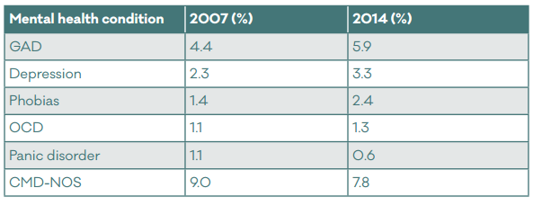
Life expectancy in the West, too, generally shows an increasing secular trend (with the notable exception of the USA recently), but this doesn’t mean we are making the right political choices. It is becoming more widely acknowledged, for example, that mental health has been neglected relative to physical health. Mental Health UK (MHUK), produce statistics evaluating the mental health of the UK population, and it seems that recently most mental health disorders among adults in the UK have increased or stayed roughly constant:

MHUK actually suspect there is an under-diagnosis, as the percentage of adults who ever having self-report mental health problems is actually about double those who have had a professional diagnosis (around 40% vs around 20%, respectively). There has been a corresponding increase other relevant indicators such as the number of suicides, as well as precursors such as suicidal thoughts and self-harm.
As in Cuba, there may be a trade-off here: extra years of life versus happy years of life. One case where this is particularly salient is that in the UK, 1 in 4 over 65s now experience depression. As some elderly participants in this Channel 4 documentary expressed, living for 75 years and being happy for the final 5 may well be preferred to living for 77 years and being depressed for the final 7. Indeed, the NHS often makes this kind of judgement when calculating the beneficial effect of new drugs by using ‘quality adjusted’ years of life instead of just years of life. The simple observation that life expectancy has increased is not enough to tell us whether policy has succeeded or failed when we take this broader perspective.
Outcomes which seem prima facie good may therefore be increasing for the wrong reasons; or at least, they may increase while other, equally important aspects of life decline or stagnate. Returning to the example of the reduction in global poverty, one 2009 paper noted that in a majority of developing countries incidences of food insecurity are actually higher in urban than rural areas, and that urban areas have much higher exposure to organised crime and trafficking. Similarly, a recent study in Ethiopa found that many who moved to work in sweatshops were worse off due to worse conditions, longer hours and increased safety risks. An increase in income among the poorest in the world may not tell us the full story about their well-being.
This is as true for indicators such as literacy and education as it is for health and income. According to The Economist, Saudi Arabia appears to do well on gender equality, literacy and education simply because “women outnumber men in universities because they are allowed to do little else but study.” One paper at last year’s RES conference pointed out that although education in Sub-Saharan Africa has increased by a lot over the past few decades, the education is of such low quality that it’s not obvious this is a good thing (sadly I can’t remember the paper’s title). It would be a stretch to suggest something like this is true of every social indicator individually, but a version of this problem does resurface on a larger scale.
Choose Your Outcomes Wisely
Any statistical argument that progress is taking place hinges crucially on assumptions about what progress means. Your view of the world can therefore change depending on which outcomes you are most concerned about. It would not be unfair to suggest that most ‘The World is Getting Better’ articles largely focus on indicators that are related to material progress: whether directly, such as income and poverty; or indirectly, such as physical health gains. It is therefore fair to ask whether or not these things necessarily improve peoples’ well-being, since material progress may be accompanied by a decline in other aspects of peoples’ lives. People may have higher incomes and live longer, but they may experience a greater sense of alienation, stress and insecurity, and an accompanying lack of social cohesion, identity or purpose.
As Andrew Sullivan argues, it is worth asking why people seem so unhappy despite the increases in material indicators. So-called ‘New Optimists’ are wont to treat this as some kind of cognitive or media bias, but looking at different indicators may show there are valid reasons for people to be dissatisfied. It could well be, for example, that an increase in average incomes is accompanied by an increase in income volatility and a fall in job security, so that people still have greater anxiety about their employment and finances.
Data on these kinds of things are much harder to come by — perhaps because they are less easily quantified, perhaps because they reflect less the perceptions and priorities of those doing the gathering (but I’ll save that for part 4!). Fortunately, the OECD compiles an index on job security-which depends on probability of becoming unemployed, the length of unemployment and the sized of unemployment benefits. The below graph shows the percentage change in this index between 2007 and 2013:

Only rich countries have enough data to look at the change over time, though the ILO estimates that the level of job insecurity is high globally, at around 75% of all jobs. This kind of employment-related insecurity could well be contributing to huge rises in employee anxiety across the globe:

These are quite specific measures over a relatively short period of time, but even if we take a broader perspective it seems that global rates of anxiety and depression have been modestly rising over the past few decades, indicating that this is representative of a broader phenomenon:

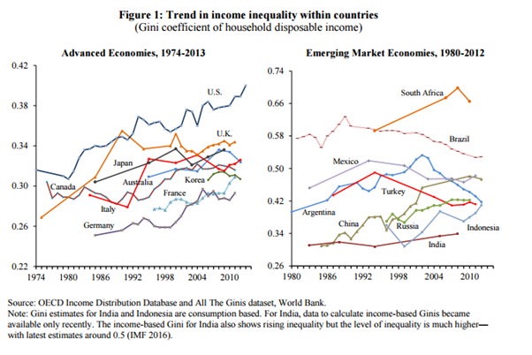
Aside from these stresses and strains, one reason peoples’ well-being is stagnating or declining could be inequality. While global inequality is falling, inequality within countries has generally been the rise over the past few decades, especially in rich countries:

According to the famous Easterlin paradox, increases in income do not increase self-reported happiness past a certain point. Easterlin argued that this is because people care about their standard of living relative to others close to them, most obviously in their own country. His most recent contribution on this topic, for example, shows there is a tiny and possibly even negative relationship between GDP growth and self-reported happiness across a broad range of countries:

It may therefore be that material progress does not always translate into increases in well-being. I want to be clear, however, that this evidence is suggestive and by no means settles the debate. Perhaps those who disagree with the above are frustrated by my heavy use of a broad range of statistics with minimal contextual discussion. Perhaps you think some of these statistics are misleading, or that other indicators are more important. Perhaps you have underlying philosophical views and values which mean you view my statistics in a different light. I’ve no doubt many of these points are valid. But now you know how I feel when reading some of these optimistic articles.
9 Graphs That Show Our World is Well and Truly Fucked
The previous section could throw some sand in the wheels of unconditional declarations of progress, but it is little when compared with environmental issues. Modern material progress has had an almost immeasurable impact on the environment, from the well-known but still terrifying issue of climate change to its oft-neglected cousins such as loss of biodiversity, top soil erosion, ocean acidification, species extinction and the like. One could quite easily produce an article with a title like `9 Graphs That Show We Are Completely Fucked’ based solely on environmental indicators. Which is what I’m about to do.
Much like inequality or mental health, those who argue that we are in an era of progress tend to ignore, dismiss or distort the relevant indicators about the environment. In fact, Stephen Pinker’s WSJ article gives a classic example of how to lie with statistics by arguing that emissions in the US have fallen as evidence of progress, ignoring the well-known phenomenon of ‘offshoring’ emissions to poorer countries. (It also seems his book cherry picks environmental statistics more generally, such as extinction rates). Regardless, gas tends not to respect borders and it is clear that global emissions and temperatures are rising:


…which is melting the ice:

…and therefore increasing sea levels:

As I touched on earlier, climate change is far from the whole of it and other environmental indicators are not looking great. The planetary boundaries chart illustrates nine planetary boundaries, suggesting that we are well into in the ‘danger zone’ for genetic diversity and cycles of vital nutrients, and at least out of the ‘safe zone’ for many more:

There have been corresponding increases in environmental instability, as the level of natural disasters has risen:

Aside from the impact this could have on us, our relationship with the environment has destroyed many natural habitats — deforestation, for example, is continuing to strip the Amazon:
An especially worrying consequence of all this is that many scientists believe we are in a new era of mass extinction:

This represents a huge loss of life and of biodiversity. And while we’re on the subject of animals, it is worth mentioning my pet peeve: that the number of animals being killed by humans is at an all-time high. Even in the US alone it eclipses any trends in violence against humans:

Globally the figure is about 150bn, which translates into an unimaginable amount of death and suffering even as you’ve been reading this post. Personally I don’t see why this should be weighted any lower than human suffering, but I digress-the important point for this post is that once more this issue cannot be settled with statistics alone.
Measuring Progress
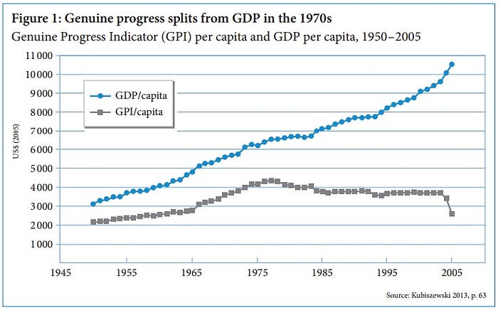
In summary, it cannot be assumed a priori that certain indicators prove the presence (or absence) of progress. The improvement in one outcome may hide crucial context or ignore other important outcomes which are moving in the opposite direction. A final statistic which in some sense assimilates the above is the ‘Genuine Progress Indicator’ (GPI), which tries to incorporate these broader considerations of welfare — including the environment — into calculations of GDP, our favourite metric for progress. Unlike GDP, the GPI is flat or even falling over the past few decades:

Of course, the GPI is not the last say. GDP is not the last say. No indicator or set of indicators is alone, because before evaluating progress we first need to establish what it means and whether it can be adequately represented by our statistics. Ultimately the sources of human well-being, our relationship with the environment and how we balance these things with (undeniable) material needs are fundamental questions and all too often I see them ignored or given short shrift in this kind of discussion.
In the next part of this series, I will discuss the issues with the ubiquitous focus on aggregate trends in the articles celebrating progress, asking whether they really tell us what we need to know.
